Designed for the 95%
A pension app brief that started in the wrong place, and the research that proved it.
Royal London Group
How it started
I was a Senior UX Designer at Royal London, brought in to design and launch a pension app. The brief centred on deepening features for the small population already using online services. I didn't think that was the right problem. I pushed back, gathered evidence, and convinced the project sponsor to let me change course.
What the data revealed
My first move was to understand who the brief would actually reach. I worked with the online servicing team to pull registration data (something that wasn't being tracked at the time). What came back was stark. 95% of Royal London's pension customers had never registered for online access at all. The brief, as written, would target the 5% who were already engaged and, by definition, not struggling. That seemed like the wrong problem to solve.
I had a hunch that the real issue was engagement, not features. But a hunch wasn't enough to change a funded brief. I needed evidence.
The Royal London office sat next to Haymarket Station in Edinburgh, a busy transport hub for commuters. I designed a three-question guerrilla survey and took it to the station with a colleague. Between us we surveyed upwards of 100 people across a couple of trips. The questions were deliberate: do you have a pension, when did you last check it, do you know roughly how much is in it. Q1 established ownership. Q2 measured engagement: high results would point to a product issue, low results would show a universal need. Q3 worked as a confidence check and sense test on Q2.
The results were unambiguous. Most people thought they had a pension. Almost none had checked it recently. Very few had any real idea what was in it.
I took this to the project sponsor alongside the registration data. He took the evidence on board and gave me the go-ahead to change course.
1. Design for the 95%, not the 5%
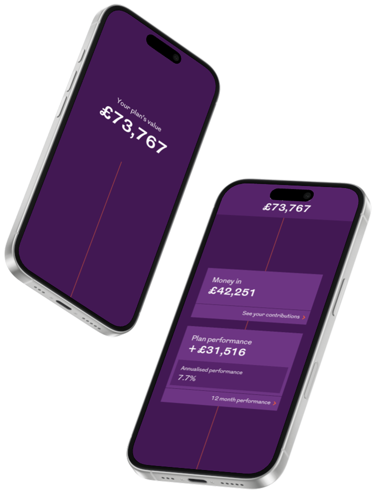
The pivot meant designing for people who had no relationship with their pension at all. These users didn't need detail. They needed visibility. Something that gave them a number, showed them where it came from, and gave them a simple view of where it might go.
A card sort with non-pension colleagues helped establish what information to surface and in what order. The information architecture came from what people actually needed, not what the system could provide.
2. Fix registration before anything else
Mapping the existing registration process revealed a critical problem. An email verification step ejected users from the app mid-registration, sending them to a separate flow and expecting them to find their way back. I worked with the security team to find an alternative that met their requirements without breaking the journey. The solution was an in-app security question set during registration, replacing email verification as a password reset fallback. Registration became straight-through. Users got to their account in one go.
3. Solve the projection performance problem without hiding it
The original design calculated future fund projections on login. Testing revealed response times of more than 18 seconds. Working with engineers, I decoupled the projection calculation from the initial API call, bringing plan value load time down to under 3 seconds. For the projection itself, I designed an interstitial screen with regulatory information and a progress prompt. The wait became informative rather than unexplained. Users read the information and understood that a calculation was in progress.
Three decisions that shaped the app
1. Design for the 95%, not the 5%
The pivot meant designing for people who had no relationship with their pension at all. These users didn't need detail. They needed visibility. Something that gave them a number, showed them where it came from, and gave them a simple view of where it might go.
A card sort with non-pension colleagues helped establish what information to surface and in what order. The information architecture came from what people actually needed, not what the system could provide.
2. Fix registration before anything else
Mapping the existing registration process revealed a critical problem. An email verification step ejected users from the app mid-registration, sending them to a separate flow and expecting them to find their way back. I worked with the security team to find an alternative that met their requirements without breaking the journey. The solution was an in-app security question set during registration, replacing email verification as a password reset fallback. Registration became straight-through. Users got to their account in one go.
3. Solve the projection performance problem without hiding it
The original design calculated future fund projections on login. Testing revealed response times of more than 18 seconds. Working with engineers, I decoupled the projection calculation from the initial API call, bringing plan value load time down to under 3 seconds. For the projection itself, I designed an interstitial screen with regulatory information and a progress prompt. The wait became informative rather than unexplained. Users read the information and understood that a calculation was in progress.
What launched
The app launched on iOS and Android. It is still in active use and rated 4.7 from over 18,000 iOS App Store reviews. The original UI design held up without significant change until recently, which, for a consumer financial product, is a long run.
The registration work had a second effect. By identifying and fixing the friction that was keeping 95% of customers from accessing their account online, the app gave Royal London a route to that disengaged majority. The problem worth solving turned out to be much bigger than the original brief.