ScotPayments
UX lead on a public sector payments service, from Beta through to live payments.
Scottish Government / Scott Logic
Strategic national infrastructure
ScotPayments now processes over £1 billion in public sector payments across Scotland. When I joined the project, it processed nothing. The service existed as a technically proven Alpha with a brief to get it to live payments. I was the UX Lead for the Beta phase and through to live service, working on behalf of Scott Logic across both the consultancy and Scottish Government teams. The Scottish Government has its own rigorous design standards. I wasn't introducing UCD to a blank canvas. I was making sure the programme applied those standards properly, under real delivery pressure, to reach live payments.
What the Alpha missed
The users were public sector finance professionals. Payments were their job, not a task they occasionally did, but the substance of their working day. Some were processing 20 or more individual payment enquiries daily. They needed a system that was fast, reliable, and efficient. What the Alpha had built was technically capable. What it hadn't done was think carefully about how those users actually worked.
Early interviews and observation sessions revealed something the system hadn't been designed around: users came to the service with three completely different types of tasks. Doing: approve today's batch. Finding: locate a specific payment in response to an enquiry. Checking: scan for anything that needs attention, without knowing in advance whether anything does. The service treated all three the same way. It shouldn't have.
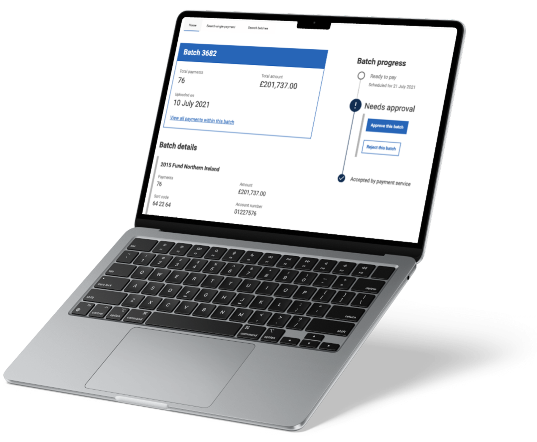
1. A structural gap nobody had spotted
The first round of usability testing with nine participants across all partner organisations showed the service failing consistently. Users couldn't approve at batch level, only at individual payment level, but they thought and worked in batches. Search results didn't carry enough information to act on. Statuses were visible but the language around them was wrong.
I ran a card sort to understand how users grouped and prioritised information. What came back was unambiguous: they arrived already knowing what they were looking for and needed the service to match that, not present everything it held.
This pointed to something more serious than a usability problem. The service had no batch detail view. Users needed to see a batch as a single entity (totals, bank details, the information required to approve or reject it) before they could act on it. Neither the Scottish Government team nor Scott Logic had identified this gap. My research surfaced it. The screen was built, and it became the foundation of how both the doing and finding journeys worked from that point.
2. Proactive surfacing replaced speculative searching
The checking task was a different problem. Users needed to know if something had gone wrong (a returned payment, a flagged transaction) but the only way to find out was to search through everything on the chance something was there. For the smallest organisation on the service, that meant scanning thousands of payments every day.
Quantitative follow-up confirmed how often exceptions actually occurred. It was frequent enough to matter. The answer wasn't a better search. It was surfacing what needed attention before users went looking for it. I tested this with first-impression and 5-second tests. The response was immediate: "Actions you need to take, that makes perfect sense. It's great that there are numbers there."
3. Three rounds of usability testing, each targeting a different layer
The first round exposed problems in the information architecture. The second validated the new task-based design. The third confirmed the interface worked for real checking scenarios. I brought the whole team in as observers throughout. Seeing users struggle with their own service is more persuasive than any design recommendation.
Three decisions that shaped the service
1. A structural gap nobody had spotted
The first round of usability testing with nine participants across all partner organisations showed the service failing consistently. Users couldn't approve at batch level, only at individual payment level, but they thought and worked in batches. Search results didn't carry enough information to act on. Statuses were visible but the language around them was wrong.
I ran a card sort to understand how users grouped and prioritised information. What came back was unambiguous: they arrived already knowing what they were looking for and needed the service to match that, not present everything it held.
This pointed to something more serious than a usability problem. The service had no batch detail view. Users needed to see a batch as a single entity (totals, bank details, the information required to approve or reject it) before they could act on it. Neither the Scottish Government team nor Scott Logic had identified this gap. My research surfaced it. The screen was built, and it became the foundation of how both the doing and finding journeys worked from that point.
2. Proactive surfacing replaced speculative searching
The checking task was a different problem. Users needed to know if something had gone wrong (a returned payment, a flagged transaction) but the only way to find out was to search through everything on the chance something was there. For the smallest organisation on the service, that meant scanning thousands of payments every day.
Quantitative follow-up confirmed how often exceptions actually occurred. It was frequent enough to matter. The answer wasn't a better search. It was surfacing what needed attention before users went looking for it. I tested this with first-impression and 5-second tests. The response was immediate: "Actions you need to take, that makes perfect sense. It's great that there are numbers there."
3. Three rounds of usability testing, each targeting a different layer
The first round exposed problems in the information architecture. The second validated the new task-based design. The third confirmed the interface worked for real checking scenarios. I brought the whole team in as observers throughout. Seeing users struggle with their own service is more persuasive than any design recommendation.
What launched
The service launched fully WCAG 2.1 AA-compliant. By the end of 2023, it had processed over 6,000 payments totalling £13.5m across six organisations. The design patterns and research contributed back to the Scottish Government Design System for other services to build on.
The work that mattered most wasn't any individual screen. It was catching a structural problem early enough to fix it before it became a live service that finance professionals had to fight with every day.